
How to Read Crypto Charts (Without Pretending to Trade)
Learning how to read crypto charts is a literacy skill, not a trading skill. This guide teaches you what charts actually show, what they cannot show, and how to read one well enough to make sense of what you are seeing without pretending to be a trader.
Key Takeaways
- Every crypto chart shows four things: price, time, volume, and liquidity. Reading a chart means reading those four dimensions in order.
- Charts describe what the market has done. They do not predict what the market will do next, and they do not tell you anything about a project's fundamentals.
- Most beginners only need a candlestick chart, a daily or 4-hour timeframe, and a habit of starting with trend before anything else.
- Chart reading breaks down on illiquid altcoins, freshly launched tokens, and post-event spikes. Recognizing a chart that is too thin to read is part of the skill.
- Patterns describe observable buyer and seller behavior. They are not causal predictions, and treating them as predictions is the most common beginner mistake.
What a Crypto Chart Actually Is (and What It Isn't)
Most "how to read crypto charts" guides open by showing you a candlestick and explaining the green and red bars. That gets you about ten percent of the way to actually reading a chart, and it skips the more useful question first: what is a chart showing you, and what is it not showing you?
At Blockready, we treat chart reading as one part of an evaluation toolkit, alongside whitepapers, tokenomics, on-chain research, and a structured DYOR checklist for any cryptocurrency you are considering. Chart literacy is what helps you read the market context. It is not what helps you decide whether the project behind the asset is worth holding.
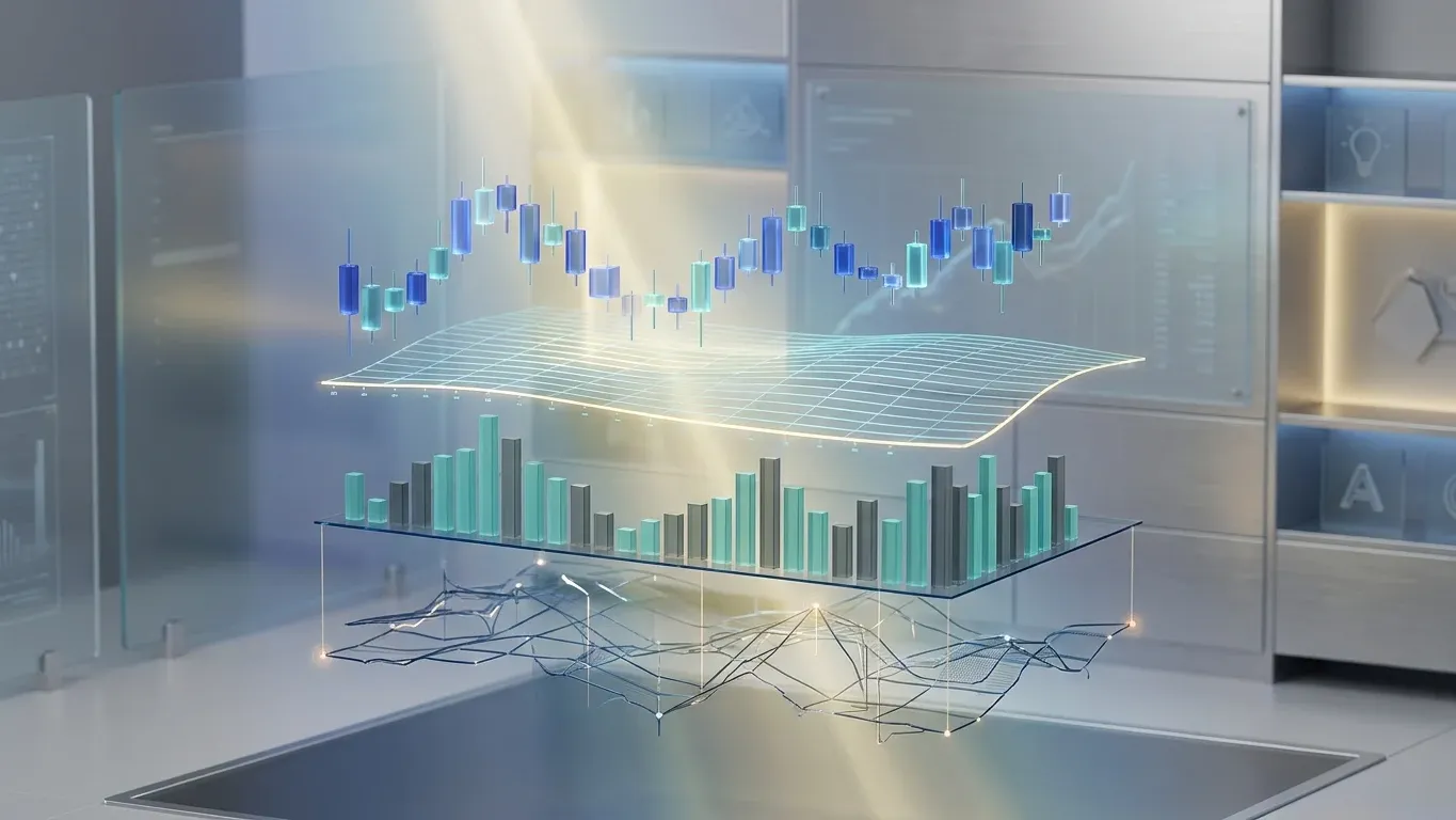
Crypto Chart
A crypto chart is a visual record of how a cryptocurrency has been priced and traded over time. It shows four things: price, time, traded volume, and observable liquidity behavior. It does not show project fundamentals, regulatory standing, custody risk, or what the price will do next.
Simple version: a chart tells you what the market has done. It does not tell you whether the asset is worth holding.
Two things follow from that definition, and both shape how the rest of this article is structured. First, chart reading is descriptive. It records observable behavior. It does not produce causal predictions, even when an indicator or pattern feels confidently directional. Second, a chart's usefulness depends entirely on whether the inputs are reliable. A chart for a high-liquidity asset like Bitcoin is a different research artifact than a chart for a freshly launched memecoin on a thin order book. Same axes, same candle shapes, very different signal quality. We will come back to that distinction in the low-liquidity section.
The Four Dimensions Every Chart Shows
Most beginner chart guides list features (line chart, bar chart, candlestick, volume bar) without naming the underlying dimensions those features are encoding. The clean way to think about a chart is in four dimensions, and reading a chart well means reading each dimension on purpose.
The Four Dimensions of a Crypto Chart
Every crypto chart encodes four things. Reading them in order builds chart literacy without requiring trading skill.
Crypto Chart
A visual record of how a cryptocurrency has been priced and traded over a chosen window of time.
Dimension 1
Price
The vertical axis. Records where the asset traded against its quote currency, often a stablecoin or USD.
Dimension 2
Time
The horizontal axis. Each candle covers one unit of the chosen timeframe, from one minute to one month.
Dimension 3
Volume
The bars below the price chart. Show how much of the asset traded in each period and how supported each move is.
Dimension 4
Liquidity
Visible indirectly through wick behavior, candle gaps, and volume thinness. Tells you whether the chart is even readable.
Framework: Blockready educational synthesis based on standard chart components.
Price and time are the dimensions every beginner notices first. Volume is the one most beginners skip, which is a problem, because a price move without volume is a different signal than the same price move with volume. Liquidity is the one almost no beginner guide names directly, even though it controls whether the other three dimensions can be trusted at all.
Dimension 1: Price
Price runs up the vertical axis. The displayed price is always quoted against something else, usually a stablecoin like USDT or USDC, or a fiat currency like USD. On most exchanges the default trading pair is BTC/USDT or ETH/USDT, so the chart is showing "how many tethers it costs to buy one bitcoin" rather than an absolute dollar number, although the two track closely.
Two technical notes about price worth knowing. Many platforms offer both linear and logarithmic price scaling. A linear scale shows equal price units as equal vertical distances. A logarithmic scale shows equal percentage moves as equal vertical distances. For long-term Bitcoin charts that span multiple cycles, log scale is usually clearer because a move from $10 to $100 is the same percentage gain as a move from $10,000 to $100,000, and only a log scale reflects that. For shorter timeframes, linear is fine. The second note: most crypto charts show price action against a single venue, so the same asset can have slightly different prices on different exchanges. For mainstream assets the spread is small. For thinly traded tokens it can be material.
Dimension 2: Time
Time runs along the horizontal axis. The thing to internalize is that one candle equals one period, and the period is whatever timeframe you have selected. On a 1-day chart, each candle is one day. On a 4-hour chart, each candle is four hours. On a 5-minute chart, each candle is five minutes. The shape of the chart will change dramatically depending on what timeframe you choose, and the same asset can look bullish on one timeframe and bearish on another. This is not a contradiction. It is a feature of the data.
Crypto markets are open 24/7. Unlike traditional stock markets, there is no opening bell or closing bell, so daily candles typically reset at 00:00 UTC. This matters more for traders than for chart readers, but it is the reason a "daily" chart for crypto behaves differently than a daily chart for, say, Apple stock.
For beginners, our practical recommendation is to default to a 1-day or 4-hour timeframe. Lower timeframes show more detail but more noise. A pattern that looks compelling on a 5-minute chart is often invisible on the daily chart, which means it is short-term noise rather than market structure.
Dimension 3: Volume
Volume sits below the price chart, usually as vertical bars. Each bar shows how much of the asset traded during the matching candle's period. Higher bars mean more activity. Lower bars mean less.
Volume is the most underread dimension on a beginner's chart, and it is one of the easiest ways to upgrade your chart literacy. A price move that happens on rising volume is a different signal than the same price move on falling volume. Strong volume on a price increase means many participants agreed with the move. Falling volume on a price increase means the move is being carried by fewer and fewer participants, which is a weakening signal even if the price itself keeps climbing.
One important caveat: the volume shown on a chart is exchange volume, which is not the same as on-chain volume. The two can diverge sharply. Exchange volume can be inflated by wash trading on lower-tier venues, where actors buy and sell the same asset back to themselves to create the appearance of activity. The U.S. Securities and Exchange Commission's investor alert on crypto asset securities notes that crypto trading platforms may lack the standard protections against manipulation, front-running, and wash trades that registered securities exchanges are subject to.
On-chain volume can include transactions that have nothing to do with trading. A 5-step framework for reading on-chain whale activity covers the distinction in more depth, including the specific noise problems beginners run into when they treat exchange volume as a proxy for real participation.
Dimension 4: Liquidity
Liquidity is the dimension you cannot see directly. There is no "liquidity bar" at the bottom of the chart. But the chart still reveals it indirectly, mainly through three signals: wick length relative to candle body, gaps between candles, and overall volume consistency.
Long wicks on otherwise small-bodied candles often mean a single large order moved the price quickly, then the order book absorbed it and price returned. That is a low-liquidity signal. So are visible gaps between candle open and close levels, where price jumped because there were no resting orders in between. And so is volume that comes in irregular bursts rather than a steady baseline. When all three signals appear together, you are looking at a chart that is partly noise. We will return to this in the failure-mode section because it is where the framework actually breaks down for beginners.
The Three Chart Types and What Each Is For
Crypto charts come in three common formats. They show the same underlying data, but they communicate it differently, and choosing the right format for your purpose is the easiest first decision in chart reading.
Three Chart Types, Three Uses
Framework: Blockready educational synthesis.
A line chart connects closing prices across the selected timeframe. It strips out intraperiod movement and shows direction. That is useful when you only want to know "what has the price been doing over the last six months." It is less useful when you want to read structure.
A bar chart shows each period's open, high, low, and close as a single vertical bar with horizontal ticks. It carries more information than a line chart but is harder to scan visually than a candlestick. Most crypto readers skip it.
A candlestick chart shows the same four prices, but as a body and two wicks. The body represents the open-to-close range. The wicks (also called shadows) extend to the highest and lowest prices reached during the period. A green or hollow candle means the close was higher than the open. A red or filled candle means the close was lower. Most platforms default to candlesticks because the structure is easier to read at a glance once you know what you are looking at.
How to Read a Candlestick (in Practice)
The body of a candle is what the price actually did over the period. The wicks tell you where the price tried to go but did not stay. A candle with a large body and small wicks means price moved decisively in one direction. A candle with a small body and long wicks means price tried to move but got pulled back, often by the opposing side of the order book stepping in.
That distinction matters because the same close-to-close move can come from completely different structural situations. A long upper wick on a green candle means buyers pushed the price up during the period but sellers absorbed it back down before close. That is rejection. A long lower wick on a red candle means the opposite: sellers pushed price down, buyers absorbed it back up. Wicks are evidence that a level was tested. The body is evidence of who won the test.
One pattern worth knowing in isolation is the doji, which is a candle with almost no body because open and close are nearly the same. Doji candles signal indecision in that timeframe. They are not predictive on their own, but in context (at the top of a strong move, near a key level, after several decisive candles) they sometimes mark hesitation that precedes a turn. The word "sometimes" is doing real work in that sentence.
The Four-Step Reading Order
The single most useful thing a beginner can do is read a chart in a deliberate order rather than trying to absorb everything at once. The order below is the one we recommend for most readers. It maps directly to the four dimensions and adds one optional confirmation layer.
A Four-Step Order for Reading Any Crypto Chart
Use this order every time. Skipping a step usually produces a misleading read.
Framework: Blockready educational synthesis. Educational only, not financial advice.
Step 1 anchors everything. If you do not know what the trend is, every other read is unstable. Higher highs and higher lows is an uptrend. Lower highs and lower lows is a downtrend. Sideways movement that respects a band is a range. Most charts are in one of these three states, and the timeframe you check matters: a daily uptrend can contain hours of downtrend within it.
Step 2 is the part most people understand intuitively but execute poorly. Support and resistance are levels where price has repeatedly stalled. They are zones, not exact lines, because real order books are messy. Mark them by looking at where price has reversed or hesitated more than once on your chosen timeframe. If a level has been respected three or four times, it matters more than a level tested only once.
Step 3 is the step most beginners skip entirely. Look at the volume bars. A breakout above resistance on rising volume is a different read than a breakout on falling volume. The first has participation behind it. The second is more likely to fail.
Step 4 is optional, and it is genuinely optional. A reader who has done Steps 1 to 3 already has more than most people who add five overlays to their chart. If you do add an indicator, pick one and stay with it for a few weeks rather than rotating between four. The RSI flags whether an asset is in overbought or oversold territory relative to its recent history. The 50-day or 200-day moving average gives you a slow-moving reference line for trend. Both have their uses. Neither predicts the future.
What Charts Cannot Tell You
This is the section most beginner chart guides skip, and it is the most important one. A chart is a record of one type of behavior: trading. It is silent on everything else. Treating it as a complete picture of an asset is the single biggest beginner mistake in crypto research.
What Charts Show vs What Charts Don't
A chart is a partial record. The questions it cannot answer are the questions that usually decide whether an asset is worth holding.
Misconception
A strong chart means a strong project
Charts record buying and selling. They cannot tell you whether the underlying project has a working product, a credible team, or a sustainable economic design.
Reality
A chart only shows market behavior
Strong charts can sit on top of weak projects, sometimes for months. Weak charts can sit on top of strong projects, sometimes for months. The chart and the fundamentals are separate dimensions.
Misconception
A pattern predicts what comes next
Patterns are not causal forecasts. They describe observable buyer-and-seller behavior that has tended to recur, with real failure rates.
Reality
Patterns are probabilistic, not predictive
Even patterns that recur reliably fail a meaningful share of the time, especially in choppy markets or after sudden news. Acting on a pattern without a defined invalidation point is not chart reading. It is hope.
Misconception
All charts are equally readable
A chart for Bitcoin on a major exchange behaves differently than a chart for a freshly launched token with $200,000 in daily volume.
Reality
Chart reliability depends on liquidity
On thin markets, single orders can produce dramatic candles that look like signals but are mostly noise. Recognizing an unreadable chart is part of chart literacy.
Framework: Blockready educational synthesis based on standard market analysis principles.
A chart cannot tell you who is on the project's team, whether the token has a real use case, or whether the protocol earns real fees from real users. Blockready's five-step framework for crypto fundamental analysis covers those questions, because they cannot be answered from price action.
A chart also cannot tell you whether the token's economic design is sound. Vesting schedules, supply inflation, treasury allocations, and emissions curves can all hollow out a project that looks healthy on the chart. The six components of every token's economic design handle those questions on a separate dimension.
A chart cannot tell you whether the visible market cap reflects most of the eventual token supply or only a small fraction of it. A project with 10 percent of its tokens circulating and the remaining 90 percent scheduled for future release has a fundamentally different supply profile than one already fully circulating. How market cap can mislead crypto investors covers the gap between price, circulating supply, and fully diluted valuation.
The list extends further. A chart cannot tell you how US securities law actually classifies a crypto asset, whether the issuer has reserves backing a stablecoin peg, whether a custodial exchange holds your funds in segregated accounts, or whether a smart contract has been audited. The chart is silent on every one of these questions. Used inside its actual scope, it is a useful research input. Used as a substitute for project evaluation, it is misleading.
The Low-Liquidity Failure Mode
Chart reading breaks down in three specific situations. The first is illiquid altcoins, especially tokens outside the top 100 by market capitalization on lower-tier exchanges. The second is freshly launched tokens with limited trading history. The third is post-event spikes (news, exchange listings, social-media-driven attention) where volume comes in irregular bursts and unwinds just as quickly. In all three, the chart is still drawn, but the inputs are too noisy to support meaningful reading.
When Chart Reading Stops Working
Three scenarios where the same chart-reading framework produces misleading reads. Recognizing them is part of the skill.
Scenario 1: Illiquid altcoin
A token outside the top 100 by market cap with a few hundred thousand dollars in daily volume.
Single large orders can move price several percent. Long wicks dominate. Volume bars come in bursts rather than a steady baseline. Patterns appear but fail more often than they hold.
Useful response: treat the chart as low-signal. Lean on fundamental and on-chain analysis instead.
Scenario 2: Freshly launched token
A token live for days or a few weeks with limited price history.
Not enough data to identify trend or meaningful support and resistance. Early candles often reflect launch mechanics, airdrop unlocks, or insider selling rather than market sentiment.
Useful response: wait for several weeks of trading history before treating the chart as readable. Use fundamentals and tokenomics review in the meantime.
Scenario 3: Post-event spike
A news catalyst, exchange listing, or viral attention event creates a sudden volume surge.
Volume reads can be inflated by short-term traders rather than durable participants. Patterns that form during the spike often invalidate quickly as attention fades.
Useful response: wait for the post-event chop to settle, usually several days to weeks, before treating new chart structure as meaningful.
Framework: Blockready educational synthesis. Educational only, not financial advice.
The common thread across these scenarios is signal-to-noise. The chart is technically there. The chart-reading framework still applies. But the noise overwhelms the signal, and the patterns that appear are mostly artifacts of thin participation rather than market structure. Chainalysis's 2025 analysis of crypto market manipulation identified more than 23,000 unique addresses across Ethereum, BNB, and Base showing activity consistent with wash trading, a reminder that artificial volume is not a fringe issue.
For beginners, the practical risk is mistaking these manipulation patterns for genuine market signals. The four exploit vectors behind every crypto scam walk through the wash trading, spoofing, and pump-and-dump mechanics that produce chart shapes deliberately designed to look like real activity. Recognizing one of these scenarios early is more valuable than memorizing five extra chart patterns.
A Brief Word on Chart Patterns
Crypto chart guides typically devote half their length to chart patterns: head and shoulders, double tops and bottoms, triangles, flags, pennants, wedges. The patterns exist and they are not made up, but they are also less useful for beginners than they look. Two clarifications make the rest of this section easier to use.
First, patterns are descriptive, not causal. A head-and-shoulders pattern is a name for a recurring shape in buyer-and-seller behavior, not a guarantee that price will fall after the right shoulder forms. Most patterns fail a meaningful share of the time, particularly during volatile or low-liquidity conditions, which is why traders define an invalidation point before acting on one. Treating a pattern as a prediction is a category error.
Second, patterns matter more at meaningful price levels and on higher timeframes than in random spots on a 5-minute chart. A head-and-shoulders pattern at a long-standing resistance zone on the daily timeframe carries more weight than the same shape mid-range on a 15-minute chart. Confirmation also matters: most patterns are considered "complete" only after a decisive break of the neckline or trigger level on visible volume.
For beginners, the three patterns worth recognizing first are the double top, the double bottom, and the symmetrical triangle. The first two signal that a level has been tested twice and held, often preceding a reversal. The third signals consolidation that usually breaks in the direction of the prior trend. Beyond those, pattern study has rapidly diminishing returns until your underlying trend and volume reading is solid.
Common Beginner Mistakes
A few patterns recur across new chart readers, and recognizing them in your own behavior is usually more valuable than learning another indicator. The first is looking at the wrong timeframe. A pattern that looks compelling on a 5-minute chart is often invisible on the daily, which means it is short-term noise. The second is reading a single candle in isolation rather than the sequence around it. A doji on its own means almost nothing. A doji after three decisive green candles at the top of an extended move is a different read.
The third mistake is treating any indicator as a buy or sell trigger. An RSI reading of 28 is not a buy signal. It is an observation that the asset has been falling sharply against its own recent history. Whether that means anything depends on trend, level, volume, and timeframe. The fourth is using charts to make decisions on assets where chart reading does not work (illiquid tokens, freshly launched coins, post-event spikes) and pattern-hunting through the noise. The fifth, which is the meta-mistake, is checking the chart compulsively after a position is opened. If chart watching turns into anxiety, the chart has stopped being a tool and become a feedback loop. Step away from the screen when that starts.
Our View on Where Chart Literacy Fits
Our view, based on how we sequence crypto investment literacy, is that chart reading is a literacy skill, not a trading skill, and most learners benefit from treating it that way. We don't recommend learning chart reading as a substitute for project evaluation. Charts answer the question "what is the market doing right now?" They do not answer "is this project worth holding?" For the second question, you still need fundamental analysis, tokenomics review, regulatory awareness, and risk assessment. Module 9 of the full Blockready curriculum covers crypto trading and the chart-specific toolkit, including candlesticks, RSI, MACD, and Bollinger Bands, as part of a structured sequence that builds chart literacy without rushing learners into trading decisions. Picking up chart reading without the broader evaluation frame tends to produce confident reads on the wrong assets.
The Core Idea
A chart tells you what the market has done. A whitepaper, tokenomics review, and on-chain audit tell you what the asset is. Confusing the two is the most common chart-reading mistake. They are different dimensions of the same evaluation, and both belong in serious crypto research.
Frequently Asked Questions
How do you read a crypto chart for beginners?
Reading a crypto chart starts with four steps in order: identify the trend on the daily or weekly timeframe, mark support and resistance zones, check whether volume supports the current move, and optionally add one indicator like RSI for confirmation. Skipping the first three steps in favor of indicators is the most common beginner mistake. Start broad and zoom in, not the other way around.
What do candle wicks mean in trading?
Wicks show the highest and lowest prices reached during a candle's timeframe, beyond where the price actually opened and closed. A long upper wick means price was pushed up but rejected back down. A long lower wick means price was pushed down but bought back up. Wicks are evidence that a level was tested. The body of the candle shows who won the test.
What timeframe is best for crypto candlestick charts?
For most beginners, a 1-day or 4-hour timeframe produces clearer reads than lower timeframes. Daily and 4-hour charts filter out short-term noise and show market structure that holds up across sessions. Lower timeframes like 5 or 15 minutes show more detail but more false signals. Start with the higher timeframe to establish trend before checking shorter ones.
Can crypto charts predict price?
No. Crypto charts record what the market has done, not what it will do next. Patterns describe recurring buyer-and-seller behavior that has historical tendencies, but even the strongest patterns fail in roughly one of three cases under favorable conditions. Treating a chart as a prediction tool is a category error. Charts inform probability and risk framing. They do not produce forecasts.
How are crypto charts different from stock charts?
Crypto charts and stock charts share the same structural elements (price, time, volume, OHLC) but differ in three meaningful ways. Crypto markets trade 24/7, so there is no opening or closing bell and daily candles typically reset at 00:00 UTC. Crypto liquidity varies enormously by asset and venue, producing the long-wick behavior that is rare in equities. And crypto is more sensitive to news catalysts, social attention, and on-chain events than equities. The chart-reading framework still applies. The signal-to-noise ratio is just different.
When does chart reading not work?
Chart reading produces unreliable signals in three situations: on illiquid altcoins where single orders distort candles, on freshly launched tokens with limited trading history, and during post-event spikes where short-term volume masks underlying participation. In all three, the chart is technically there, but the inputs are too noisy to support meaningful reading. Recognizing one of these scenarios is part of chart literacy.
Fluent in Crypto Starts With the Vocabulary
Blockready's crypto glossary gives you clear, jargon-free definitions for the terms beginners keep running into. Bookmark it and use it whenever a crypto explanation starts speaking in acronyms.
Browse the Crypto Glossary